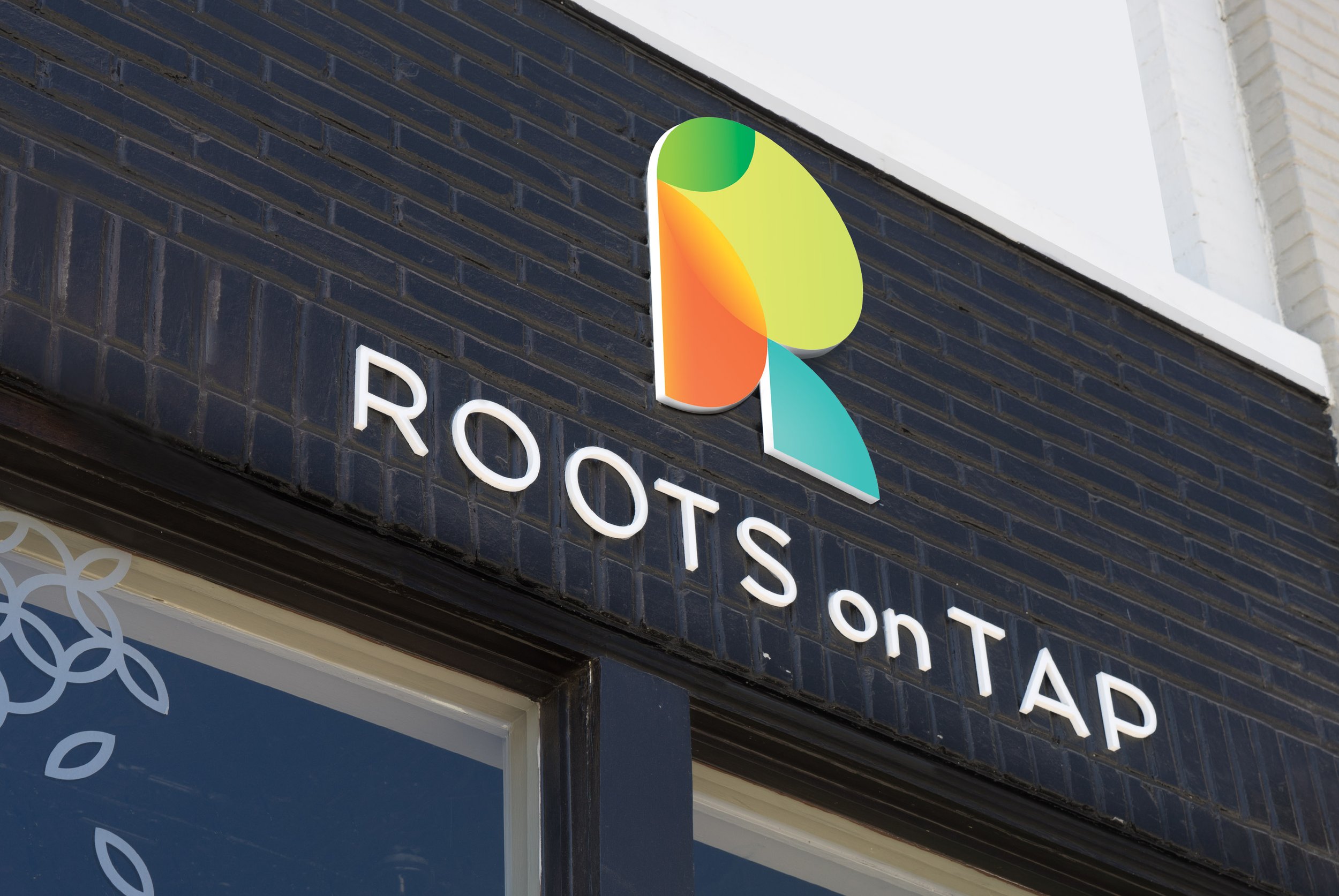
Roots on Tap is a brand we worked on from the ground up. We started with naming—Roots on Tap—and pair it with a healthier cocktail tagline “Truly Responsible Drinking”. This design positions Roots on Tap as a friendly and contemporary brand. The geometric shapes symbolize the simplicity of the organic, locally grown fruits and vegetables while overlapping to visually represent blending. This reinforces the brand’s core promise to deliver refreshing and replenishing juice blends made from simple, organic, and local fruits and vegetables. Colors are bright and saturated reflecting a vibrancy that can carry into environmental spaces, making the identity feel fresh, wholesome and familiar by design.
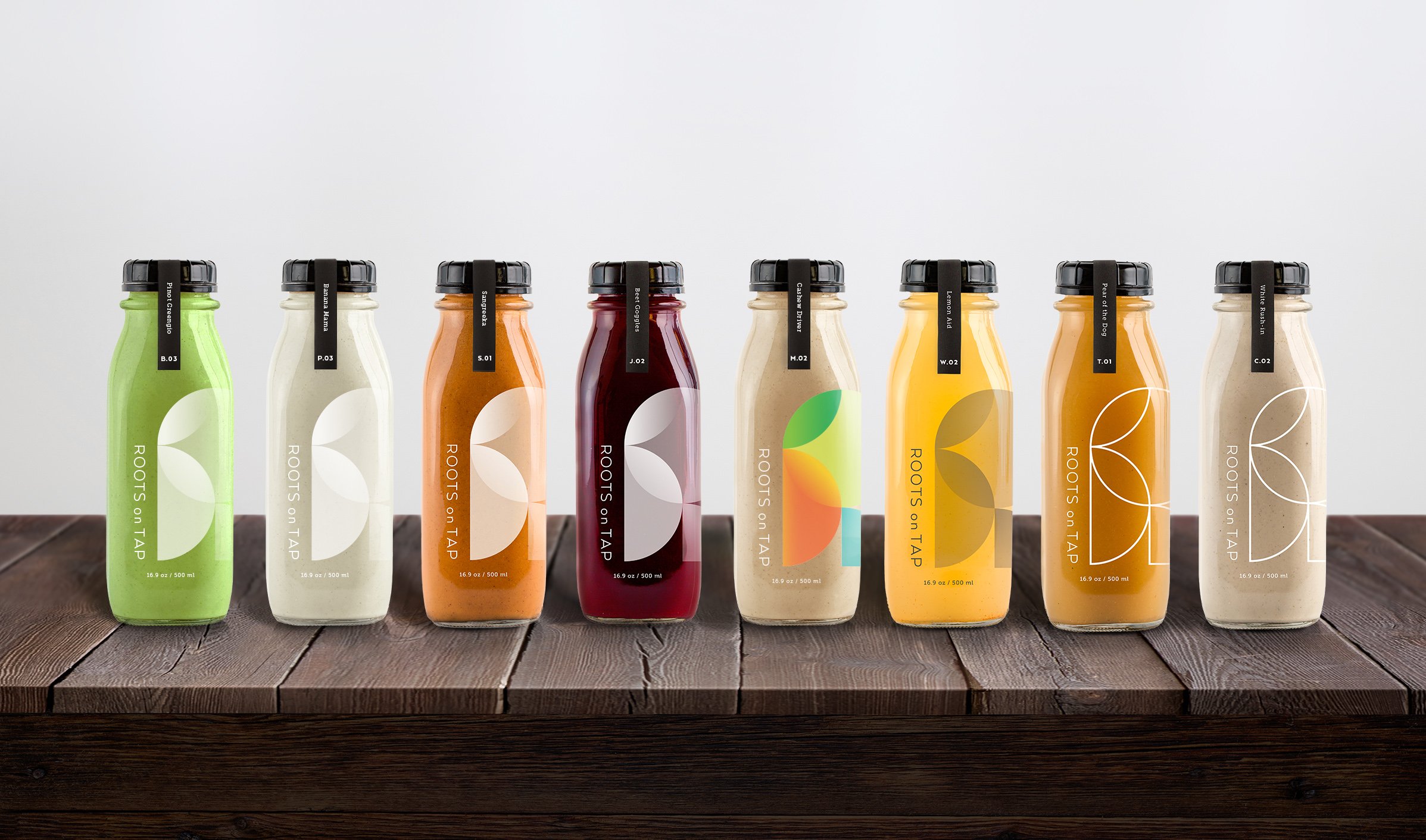
There are 8 categories, unique label treatments are created for each category:
S // Smoothies
J // Juices
B // Blends
P // Performance Blends
M // Nut Milks
W // Water
T // Tea
C // Coffee
From here, we designed an approachable snack packaging to feature their snacks. Custom stamps will be produced that will allow you to easily stamp the flavor on each package. Colored stickers will be used as flavor identifiers; branded orange for peanut butter and branded blue for berry.

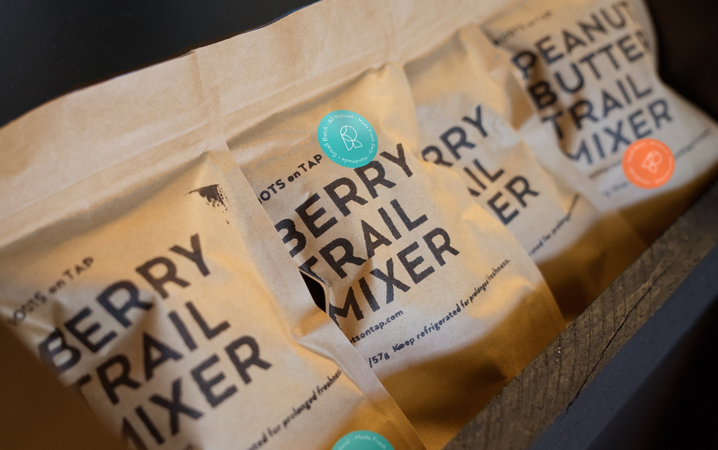

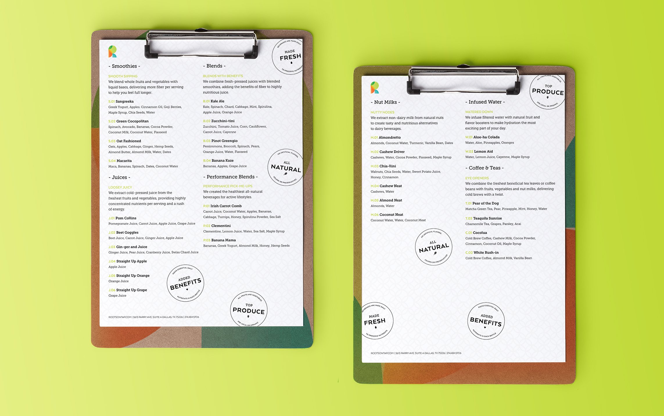
The result was a robust identity system that included the creation of a logo, stationery, packaging, storefront design and uniforms. At the same time, we carried the naming architecture into menu creation, pairing familiar cocktail names with fresh ingredients: Pear of the Dog, Oat Fashioned, Zucchini-tini and Teaquila just to name a few.
